Author and designer Gavin Ambrose, MA, interviewed by Dr. Gil Dekel.
Part 1. Part 2.
Gil Dekel: When you look at letters, what do you ‘see’? What do you ‘feel’?
Gavin Ambrose: Typography and letterforms create a large part of visual culture and communication. To a certain extent, they are so ubiquitous that we hardly notice them – but this isn’t to say they aren’t important.
The problem is, as a society we have become more concerned with immediate visual stimulant and reward, and we have developed a distain for what one might call (and indeed did call) ‘close reading’. Grayson Perry in his recent (and brilliant) BBC Reith Lectures cited the demise of ‘close reading’ in universities in favour of what is now called ‘critical studies’. I take this to be an extension of a spoon-fed educational system.
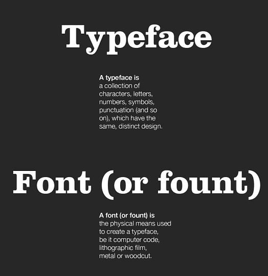
Gavin Ambrose – page from the book ‘Typography’ (Basics Design), co-authored with Paul Harris. 2006. Publisher: Fairchild Books.
In design and art there is a rich and varied tradition of approaches and styles, yet we seem intent on distilling it to a series of canons, or accepted wisdoms. Rarely these days do you get approached by students who have rediscovered something from the vaults of a library – their influences are far more likely to come from Tumblars or Pinterest boards – and that is fine, but it is lazy, as essentially someone else is doing all the editing for you. This has had a big impact on typography in education, as letterforms are becoming commodities of style, rather than conveyors of information.
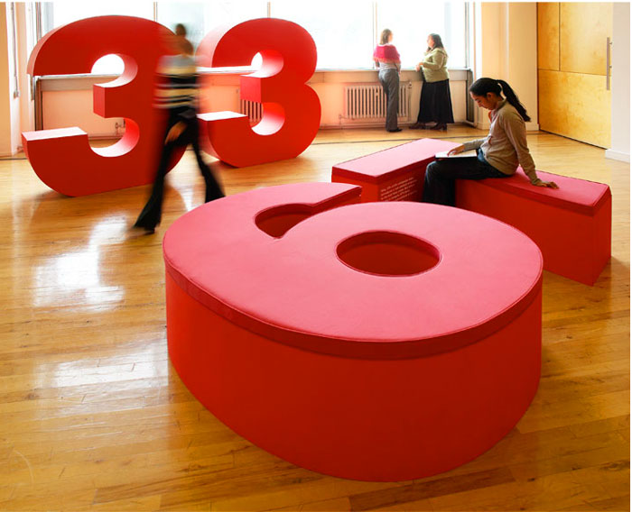
Gavin Ambrose – Installation at the Design Council, London. 1996. Oversized typography to make reference to a survey document the Design Council had commissioned on the state of the UK design industry.
Typography has the power to persuade, the ability to inform and is the natural extension of an aural tradition. It fulfils our need to record, and is a part of how we make sense of the world.
To a certain degree I’m impartial to typographic style. I enjoy looking at it, but aren’t so keen on doing it. What I do like though is when typography is used succinctly and honestly. For me, the Los Angeles guerilla artist and agit prop designer, Robbie Conal, does this better than anyone. He has a whole career, pretty much using the same typography – very little changes – and it doesn’t need to, as his messages are changing.
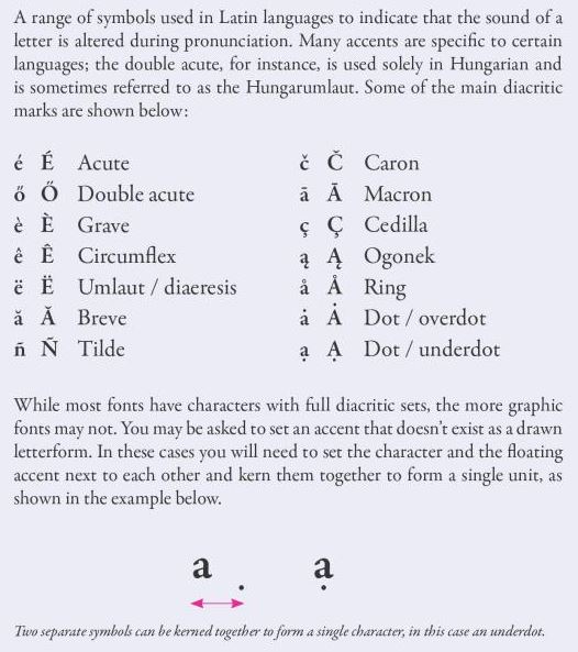
Gavin Ambrose – page from the book ‘The Visual Dictionary of Pre-press and Production’, co-authored with Paul Harris. 2010. Publisher: Fairchild Books.
I have interviewed students in the past who presented work set in Lorem Ipsum and I find this strange – but they are simply seeing type as shapes on a page, whereas we should remember type is there to be read. This isn’t to say that it always has to be serious, or even legible, but it has to have meaning. Alan Dye, at NB Studio gave me one of their London’s Kerning posters produced for the ISTD (International Society of Typographic Designers) and that is a good example of a celebration of type.
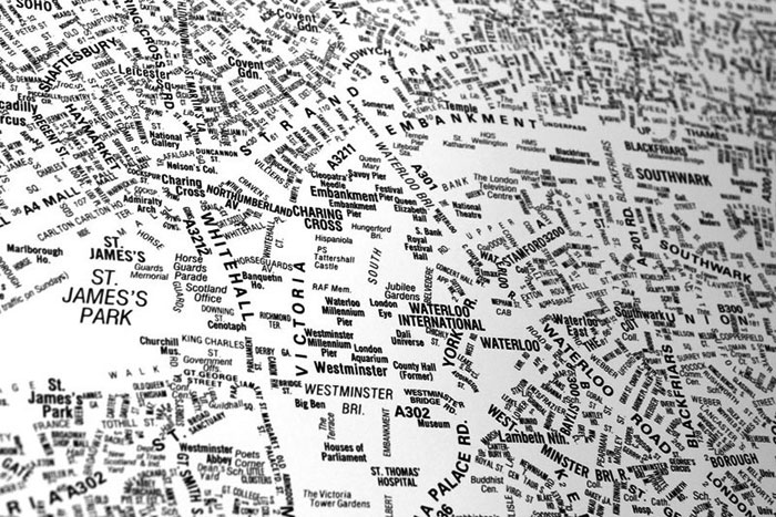
NB Studio – London’s Kerning poster for the ISTD (International Society of Type Design). 2013. A celebration of type and simple beauty of form.
Gil: what do you believe to be ‘innovation’ in graphic design?
Gavin: Arguably there are fewer innovations to find in terms of design styles. We are now in a pluralist state where we reference the past as much as look to the future. That said, the system is cyclical, and we are enjoying a resurgence in craft and tradition in design which is refreshing to see. Technology will obviously be a key driver in innovation in design, and we are seeing this with the advent of 3D printing, a system that essentially democratises manufacturing, in the same way that DTP (Desk Top Publishing) democratised graphic design.
There are also many people that can foresee some of the pitfalls of this. Julian Oliver, the brilliant and insightful artist, as early as 2008 was pre-empting what Google had been investigating with its Glass project. His Artvertiser project produced with Damian Stewart and Arturo Castro highlights the invasive nature of design messages. It argues that we should tolerate this invasion, this bombardment of corporate message, and we should be able to select our own more meaningful messages to be surrounded by. Of course he is taking an extreme point of view, but without people taking such standpoints the status quo will never be challenged.
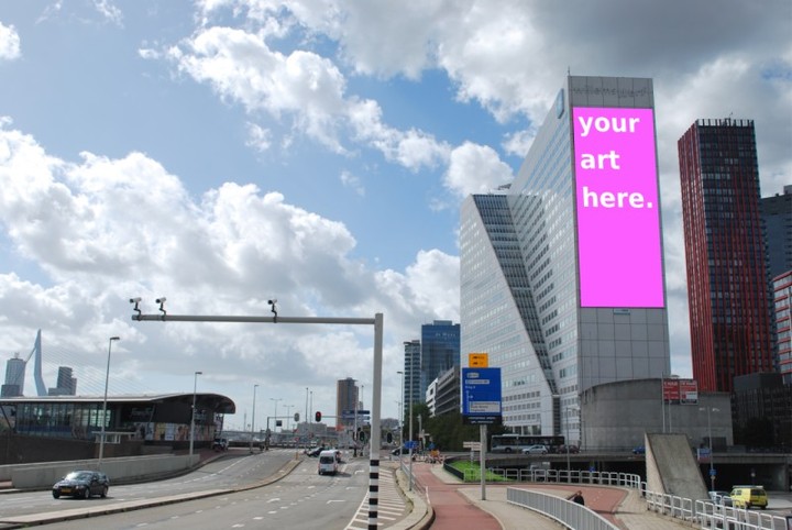
Artvertiser, Julian Oliver, Damian Stewart and Arturo Castro. 2008. A project exploring the invasive nature of design messages.
Another area I foresee as true innovation is challenging some of the erosions in reading patterns. As news etc becoming more bite-size, spoon-fed commodity, we need to find new ways to engage on a deeper and more meaningful level.
How can Graphic design help us in doing so?
Graphic design is a natural response to what is needed in society, the conveying of information, the need to differentiate products and services. What is interesting however is how graphic design shapes society – the idiom of the tail wagging the dog springs to mind. All the design that proliferates our world, magazines, posters, signage, wayfinding; how do these inform how we live. If graphic design is purely out of necessity (to define one ubiquitous bottle of water or loaf of bread from another) – then that would be a shame.
I believe designers not only solve immediate problems, but also have a small part in shaping the way society develops. Design can be a tool to inform, to educate, to entertain and to challenge, and this can only be a good thing. It can of course be exploited for ill-gain, and we collectively have to ask ourselves where we fall on that one. Are we happy to promote certain products, tobacco, alcohol, legal-highs, strip clubs etc. There is a history of challenging this, such as with The First Things First manifesto (originally published in 1964 and then reissued in 2000, and currently been issued again.)
Do you relate nature to design? Do you observe patterns, shapes or information/inspiration from nature?
I think we all naturally do this. Bob Gill in his book Graphic Design as a Second Language observes that grids are OK, but have you ever seen pigeons in a square adhere to a grid?… or falling leaves form a grid? No, they create something more fluid and natural. As a rule, without going all Zen on you, we should all take more time to observe not just nature, but our surroundings. The vernacular of what surrounds us ultimately informs who we are, how we work etc.
There are also a lot of things that we do in design that can be accredited to nature. Fibonacci, the Italian mathematician, discovered the number sequence we find in the golden section, 1, 1, 2, 3, 5, 8, 13, 21, 34 etc, where each number is the sum of the preceding two. But it is a discovery, not an invention. These perfect relationships were always there, in shells, beehives, flowers and even the Milky Way (spiral galaxy). There are certain combinations of size and form that are evidenced in nature, that just seem to work in design and there is a rich history of designers trying to exploit this. If you think of the work of Jan Tschicold for example, where he was referencing classical page design; that was in itself informed by Greek and Roman antiquity. Arguably, the more homogenised, digitized and hybridized we become, the more important a reflection of, and influence by, nature will become.
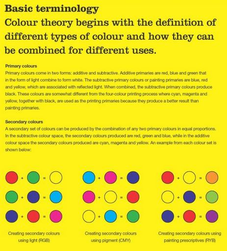
Gavin Ambrose – page from the book ‘Basics Design 05: Colour’, co-authored with Paul Harris. 2006. Publisher: Fairchild Books Ava.
How did you ‘become’ a professional designer?
I was always interested in drawing, packaging, and general printed ephemera. But didn’t really know that somehow, collectively that was graphic design… At school I did a work experience at a very small design studio in Manchester, and this was pre-mac. So they cast of manuscripts, worked out enlargements for transparencies etc – all of which was a massive mystery… I was amazed there was maths involved. The students of today wouldn’t believe the effort that went into getting some type on a page.
Everything then needed far more forward planning, arguably more thinking than is now required. In some ways you may argue that it is good to dispel that mystery, to make design more democratic. But overall I think this has led to a lowering of standards. Brian Webb once told me that when he started design school his letterpress tutor told him ‘you can’t cheat type, it is made of metal, not rubber’. I guess now people can cheat type, you can do what you want, but is that for the good?
End of Part 1. Go to Part 2.
11 April 2014.
Exclusive Publishing Rights © Gil Dekel. Interview © Gavin Ambrose and Gil Dekel. Images © Gavin Ambrose. Interview conducted via email correspondence between 10 May 2013 and 10 April 2014. Gavin is based in Kent, UK. Gil is based in Southampton, UK. Gavin website: http://www.gavinambrose.co.uk/

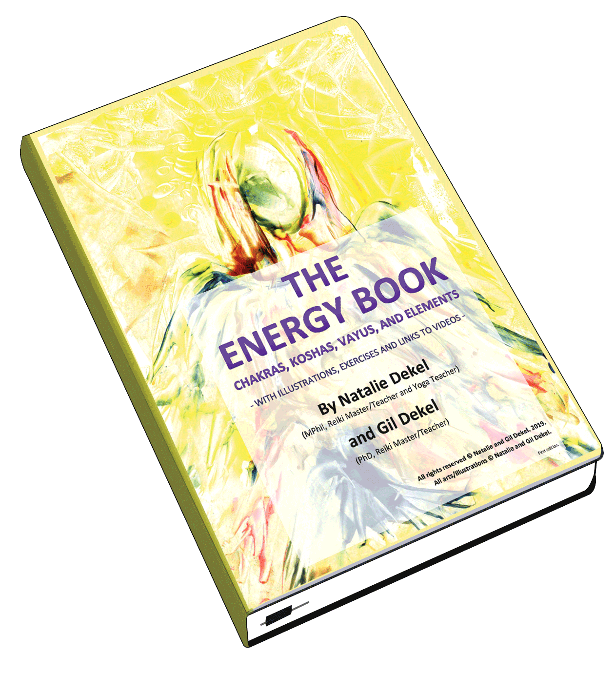
 - Reading with Natalie, book here...
Appreciating the hard work you put into your website and detailed information you present. It’s awesome to come across a blog every once in a while that isn’t the same out of date rehashed information. Wonderful read!