Being alert to the surroundings and letting the ideas come: Eddie Curtis interviewed by Gil Dekel
5 July 2024 – Vol 2, Issue 3.
Gil: How do you ‘find’ the image to create in your art?
Eddie: I don’t specifically search for the image. I tend to go out walking, and sometimes something will just catch my attention. That’s when I know that I want to create that image, although it’s not immediately obvious what exactly has captured my attention. One of the nice things about walking is that you can stop and look closely. I will stop and think about what it is in the image that is catching my eye. It could be a striking colour, a particular form, or something about the composition, like a unique perspective.
Gil: Your work involves a process of abstraction and simplification of the scene to essential elements. How do you achieve this?
Eddie: I try to identify one or two key elements that attracted me to the scene in the first place. Those are the elements I make sure to include in the artwork, and then I discard others that are not critical. With linocut, I’m restricted in the number of colours I can use – maybe five or six at most. There might be one or two important colours in the image, and the rest will be less striking because they’re not critical to what I want to capture. The less important objects might all be rendered in the same colour in the artwork, even though in reality they have varied colours. I focus on the colours that matter most to the image, and those are the ones I use in the final work.
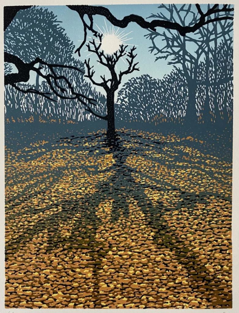
‘Oak Wood in January’, 16cm x 21cm, March 2024.
My goal with art is to capture my experience of the world and share it with others. By going out for long walks, I experience the world. Sometimes, I don’t get any inspiration, but other times, I might just be walking to the workshop and notice a building catching the light in an interesting way. I’ll stop, look at it, and try to analyse what’s interesting about that view. It’s a sort of serendipity. I let ideas come to me by staying alert to my surroundings.
For instance, we were looking at a tree in woodland with very orange leaf litter on the ground. I took a reference photo, but the photo’s colour was more subdued. When I was walking, the colour was vivid, so I memorised that reaction and used it in choosing the colours for the linocut print. The print ended up being more vivid than the photograph.
It’s very hard to say exactly why something captures my attention. I suppose initially it’s subconscious. That’s part of the process. I’ll see something and think, ‘Oh, there’s something about that’. My subconscious brain finds it interesting, and then I need to understand why… Often, I’ll stand for 10 or 15 minutes, sometimes half an hour, just looking and thinking about what my subconscious has picked up on.
There’s an interesting relationship between the conscious and unconscious mind. This is sometimes referred to as System 1 and System 2 thinking. System 1 is the intuitive part that reacts instinctively, saying, ‘Oh, look at that’. System 2 is the analytical part that comes into play to analyse what you’ve reacted to and determine what you want to take away from it to use in the art.
Gil: When you ‘translate’ your experience into the artwork, how do you balance detail and simplicity in your images?
Eddie: That’s an important element of image-making to think about. Some of my prints have a lot of details, and sometimes they’re quite textural. For example, in ‘Oak Wood in January’, I’ve carved every leaf on the ground, which creates a very textured effect. But other prints use very flat colours. The times when my prints have failed are often when I haven’t been clear about my approach. I need to decide whether the image will be textured and detailed or flat and stylized. Mixing the two approaches can lead to unsuccessful prints. Sometimes, too much detail can destroy the concept because it becomes a distraction. When details are everywhere we may lose focus on what the picture is about. Art is not necessarily about the detail; it can be about the perspective or the colours. So, I need to be clear about the approach I’m taking with each piece.
Gil: And, how do you treat shadows and light?
Eddie: I’m drawn to high contrast, which is why linocut appeals to me. I enjoy extreme expressions and high contrast in images. For example, in ‘Oak Wood in January’, the contrast works well because the black tree’s branches, though solid, balance the detail of the leaves on the ground. The shadows and light add depth to the piece.
In ‘Ice on the Model Boat Lake’ the high contrast of the branches against the sky and the texture of the ice are key elements. The ice creates a frosted effect, contrasting with the clear water reflection. The perspective lines and the figures walking add depth to the composition. The challenge was to capture the subtlety of the ice texture while maintaining the high contrast that defines the scene.
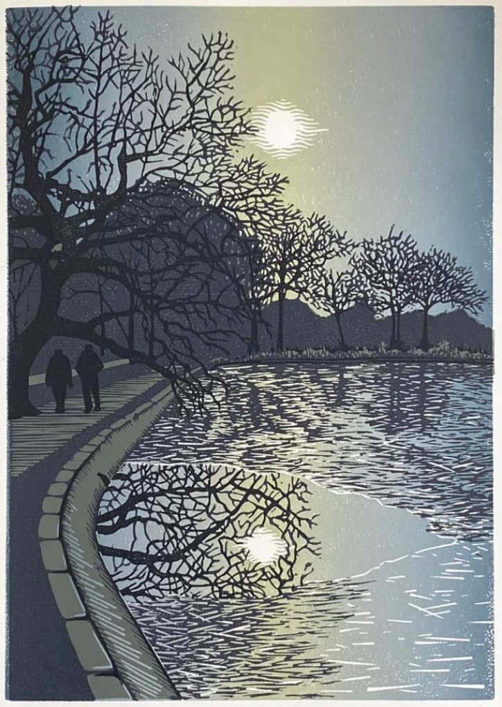
‘Ice on the Model Boat Lake’, 21cm x 30cm, February 2023.
Gil: When layering colours, do you start with the darkest or lightest?
Eddie: I nearly always start with the lightest colours and work towards the darkest. Occasionally, I reverse the process for specific effects, but it’s technically challenging. Starting with lighter colours allows for more control and precision in the final outcome.
Gil: Are you creating separate plates for each colour?
Eddie: There are two methods: multiple blocks and reduction linocut. In ‘Ice on the Model Boat Lake’ I used four blocks, each aligned to create the final image. In ‘Oak Wood in January’ I used a single block, where I progressively carved layer by layer on the same block, and printed in layers. This is the reduction method. Both methods have their advantages and are used equally in my work. The multiple block method is great for distinct elements, while reduction linocut is excellent for blending and shading.
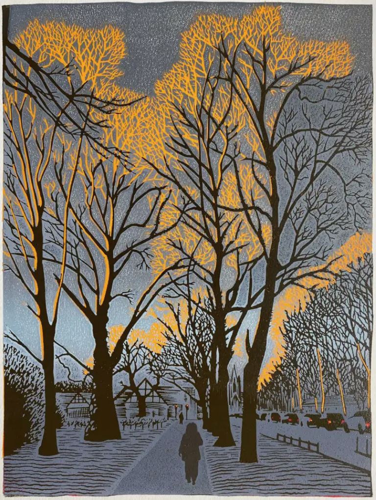
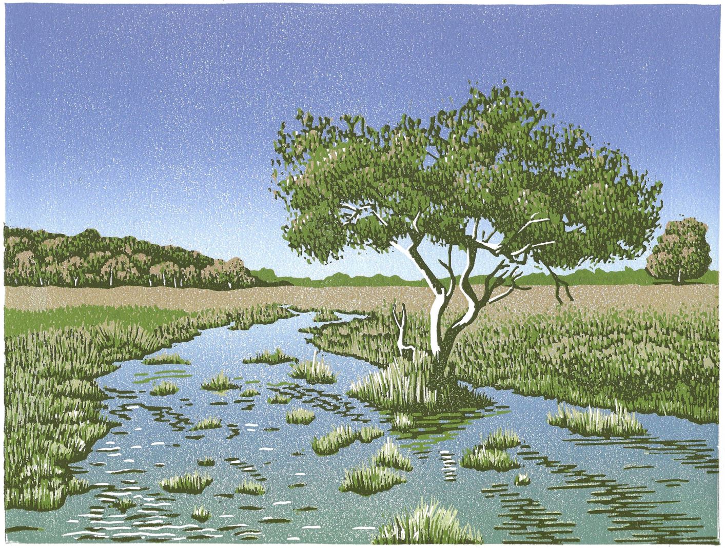
‘Asylum Green’, 25cm x 34cm, August 2023.
Gil: How do you envision three-dimensional composition through layers; what is your process?
Eddie: Early on in the process, I start thinking about colours. For instance, if I’m looking at a tree in the forest and want to create a picture, I first consider the colour palette while observing the scene. As I develop the design, I initially focus on getting the composition right, ignoring the layers. In the later stages, I think about the practicalities, such as cutting fine details or separating elements of the composition to avoid overlap, which makes it easier to cut. I do not think about layering too early but it is there eventually, or you might end up with a design you can’t implement…
Gil: Your work features both fine and thick lines.
Eddie: Yes, and I have to be conscious about the lines as I create. I have a tendency to work with a lot of detail, which is one reason linocut is quite nice; it forces me not to go too far into detail because it doesn’t allow for very fine lines. I usually want a finer line than I can achieve, so I have to pull back and think about what’s really necessary. For example, in the work ‘Oak Wood in January’, my initial sketch included all the stems and branches of the trees in the background. However, when it comes to cutting, I made just a few cuts to give a texture that implies the presence of those trees. This approach allows me to abstract some of the impressions without needing to include all the details.
Gil: We talked about depth created with light and shadow. Yet, you are also using lines to create depth.
Eddie: Yes, actually, quite a lot of depth is down to perspective lines. For example, in ‘Below Turf Hill’, the bushes aren’t exactly in the position they were when I saw them. I shifted them slightly, so they lie along a perspective line, which gives a sense of depth.
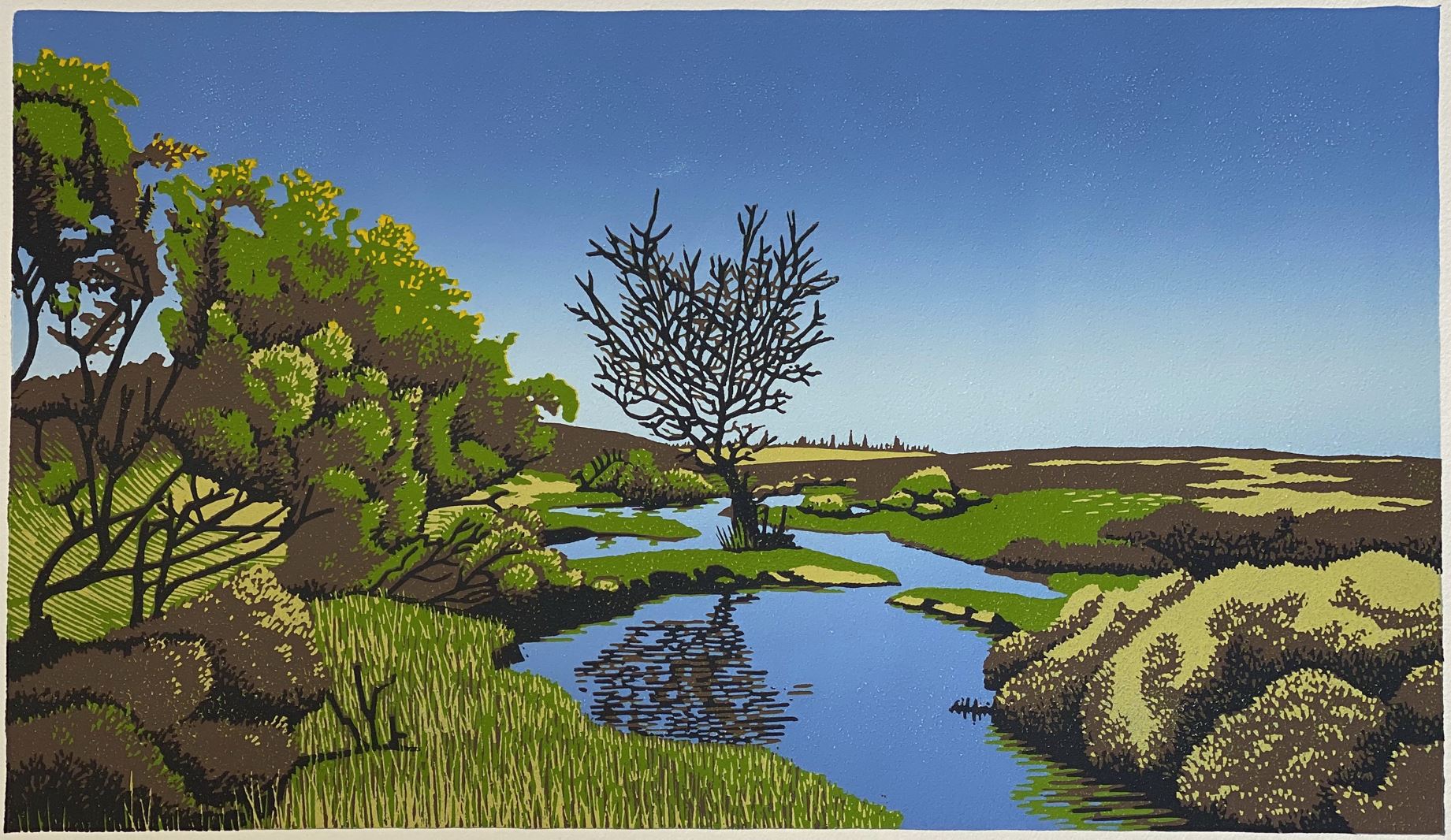
‘Below Turf Hill’, 40cm x 23cm, June 2023.
Even the grass, illustrated with green and brown lines, acts as directional lines that lead you through the landscape. I was very conscious of perspective lines in the composition. There are many small elements, like the lines of branches in the bushes, that point to the vanishing point. I exaggerated the perspective by providing little cues within the details about the perspective lines.
Gil: You’re also doing drawings in addition to linocut.
Eddie: I only started linocut printing about three years ago. Before that, I was doing line drawing. Since I began printing, I haven’t done much line drawing – only a couple. In both cases, it’s a matter of very precise ‘carving’, as the pencil is also very sharp, like the knife. In fact, my linocut carving involves some very fine gouges, finer than most linocut printers use. I try to get into a lot of detail, whereas a lot of people use linocut as a broad, open technique. I go against that ethos, getting into as much detail as the medium will permit. It’s fascinating, but it’s just my tendency to get drawn into detail, which I keep fighting against, as excessive detail doesn’t necessarily contribute to the strength of the image…
‘Penny Moor’, 26cm x 19cm, December 2022.
Gil: Is there a message you want the viewers to take from your art?
Eddie: For me, it’s really about capturing an experience of the world and putting it down in art – in a way that hopefully resonates with someone. I don’t have a specific agenda other than saying, ‘Look at this, isn’t this amazing?’
Artists that I admire help me see the world differently. I remember seeing David Hockney paintings and thinking that the colours were ‘crazy’, but then you go out and look, and realise those colours are real – they’re really there in nature, and you just need to you pay attention to see them. So, the message of art is to help people pay attention… To me, that’s a mind-expanding experience. If you can highlight an aspect of the world that others might not notice, you can enrich their experience of their surroundings.
At a glance:
© Journal of Creativity and Inspiration.
Images/art © the artists.
Eddie Curtis is a printmaker based in Southampton, England. Having studied a number of printmaking techniques as part of the foundation course in printmaking at Red Hot Press, he found a particular affinity with relief printing, and linocut in particular.
Gil Dekel is a doctor in Art, Design and Media, specializing in processes of creativity and inspiration. He is a lecturer, visionary artist, Reiki Master/Teacher, and co-author of the ‘Energy Book’. He was awarded the Queen Elizabeth II Platinum Jubilee Coin, in recognition of his dedication and commitment to pastoral work at Hampshire Constabulary.